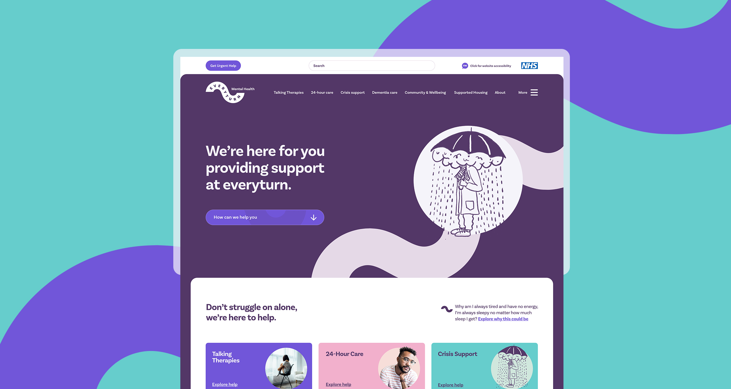
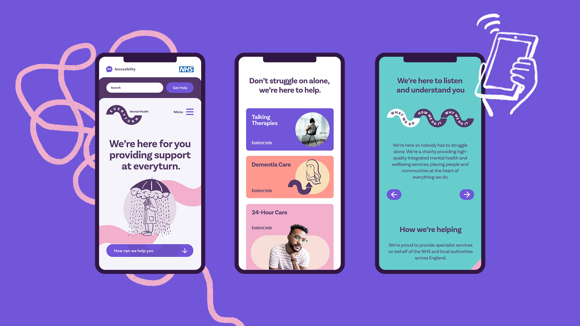
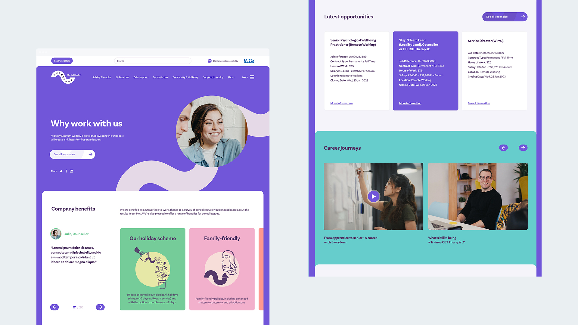
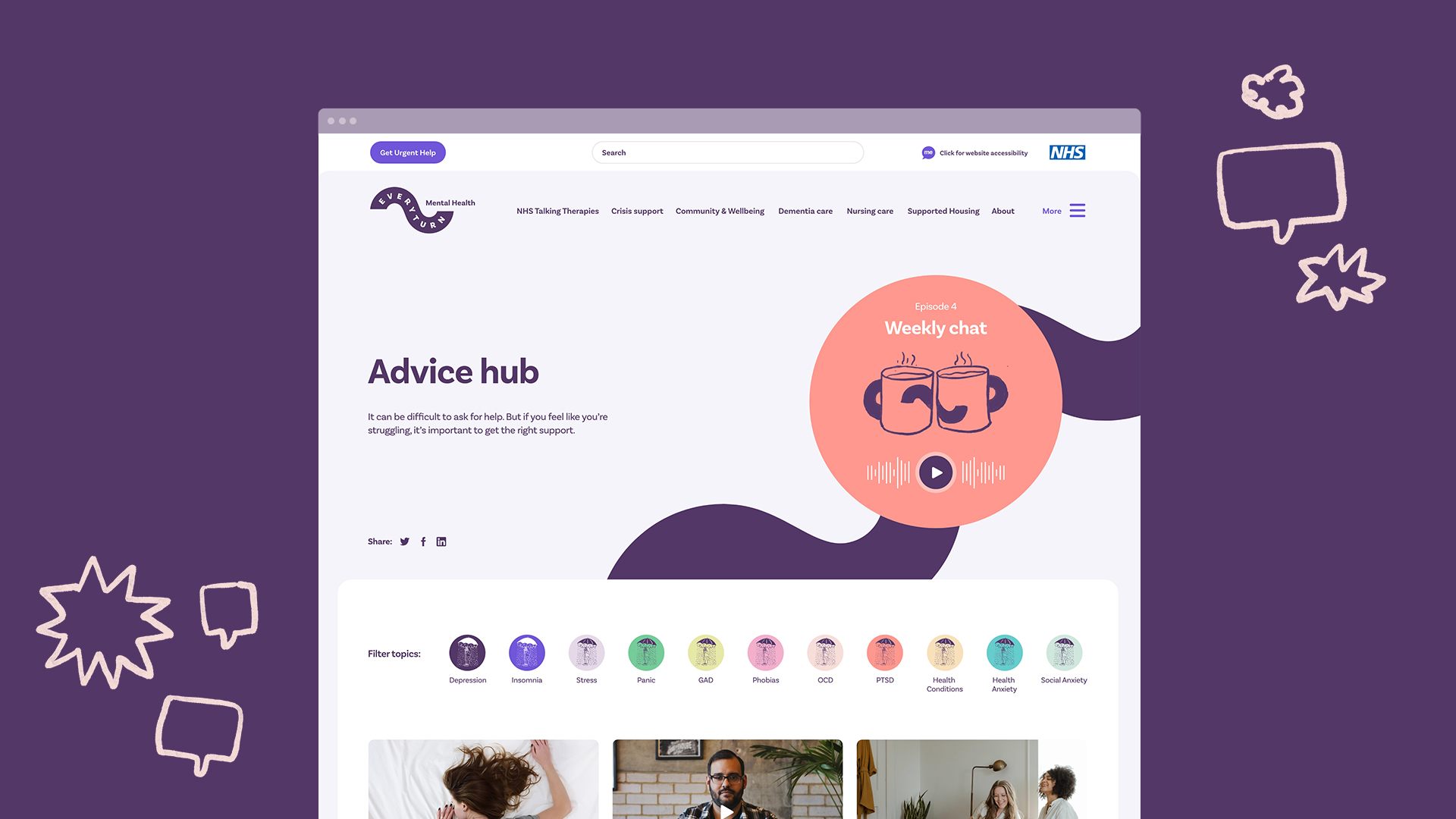
Prior to any creative work taking place, we carried out full technical audits and site crawls of the existing sites to inform the number of pages and redirects that would need to take place. In addition to this, we also reviewed analytical data to heavily inform us on how users were interacting with the website and the most popular journeys. Having worked across the sites for a number of years, we already had a good insight to this area of activity, but a fresh review always helps.
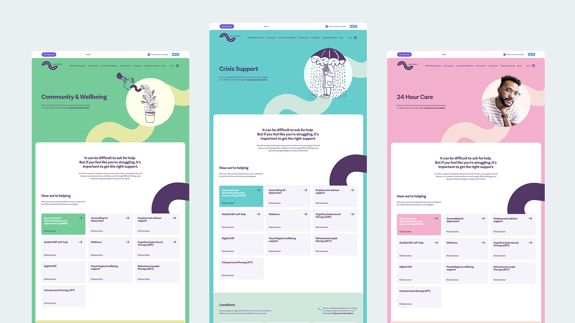
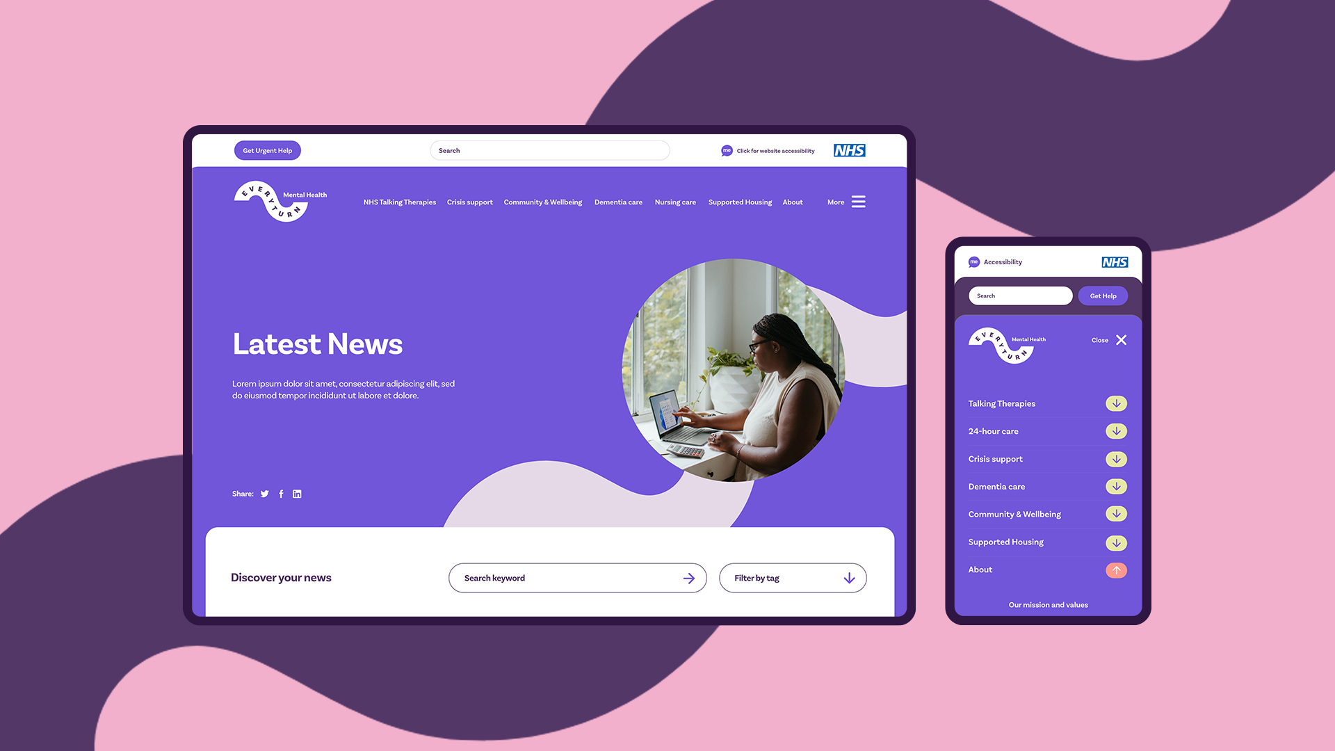
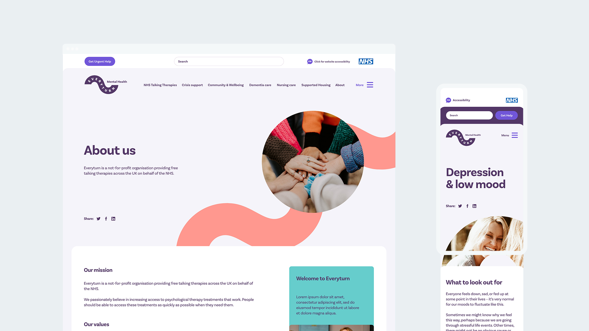
Alongside the branding project, we restructured the site content with a human focus on users, but also a technical focus on search success and visibility. Once the branding was agreed on, it meant we could start the creative part of our process and visualise how the site would look and feel.
