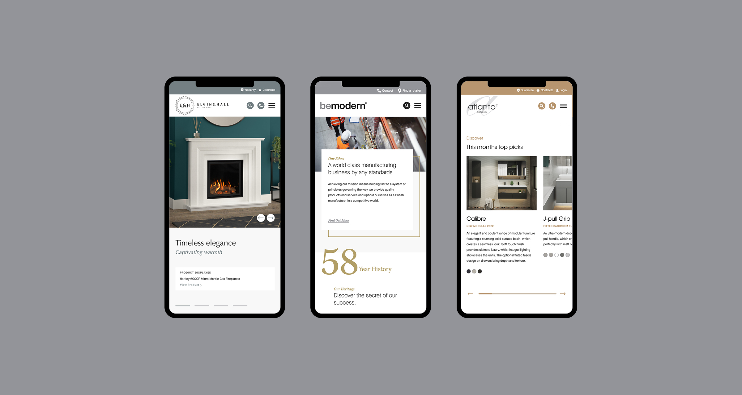
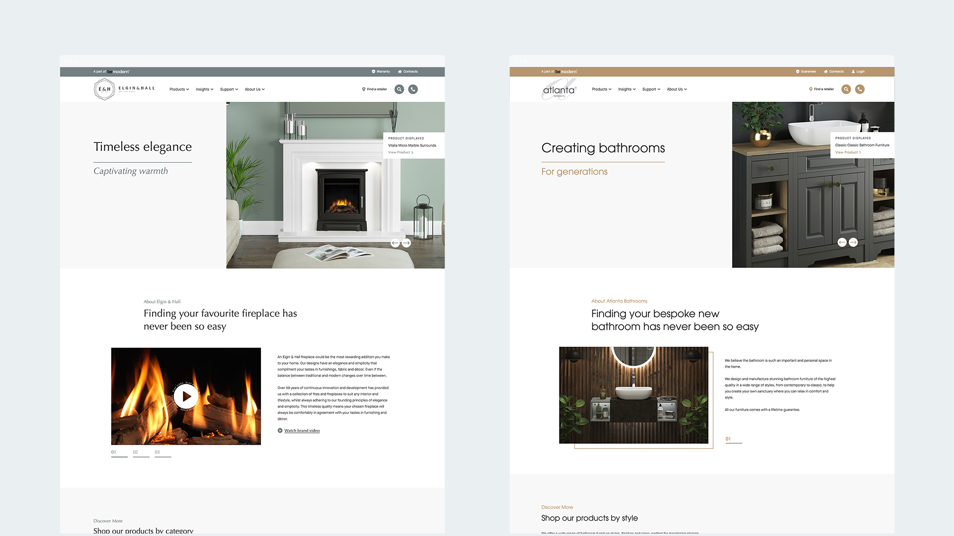
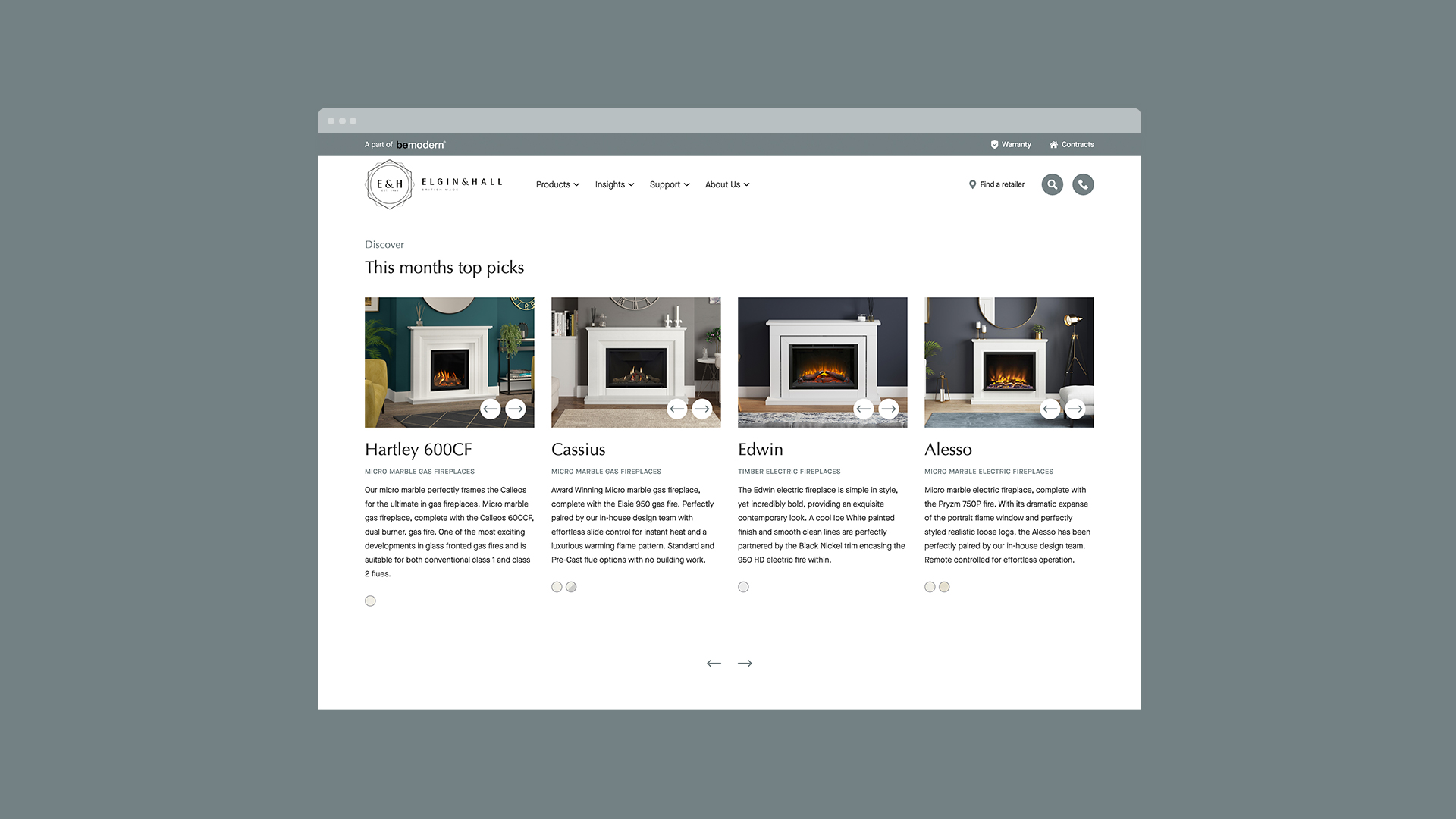
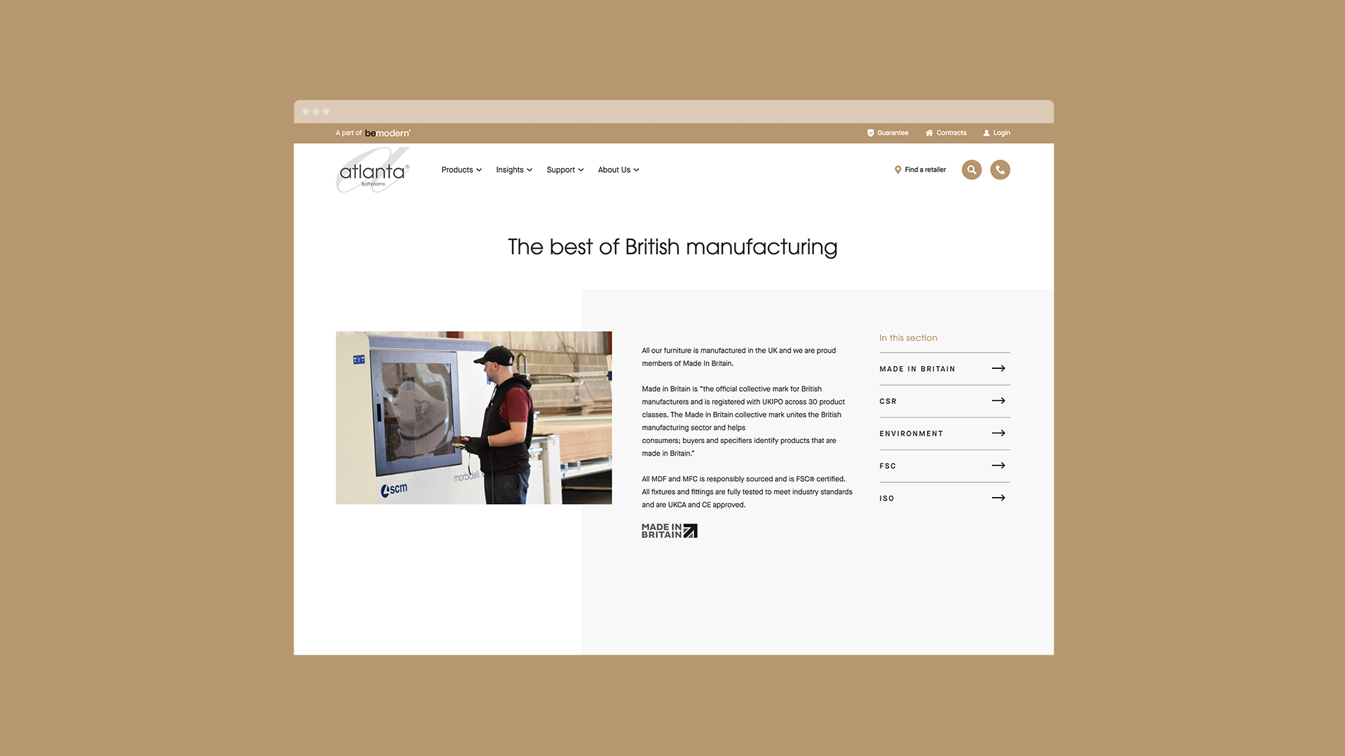
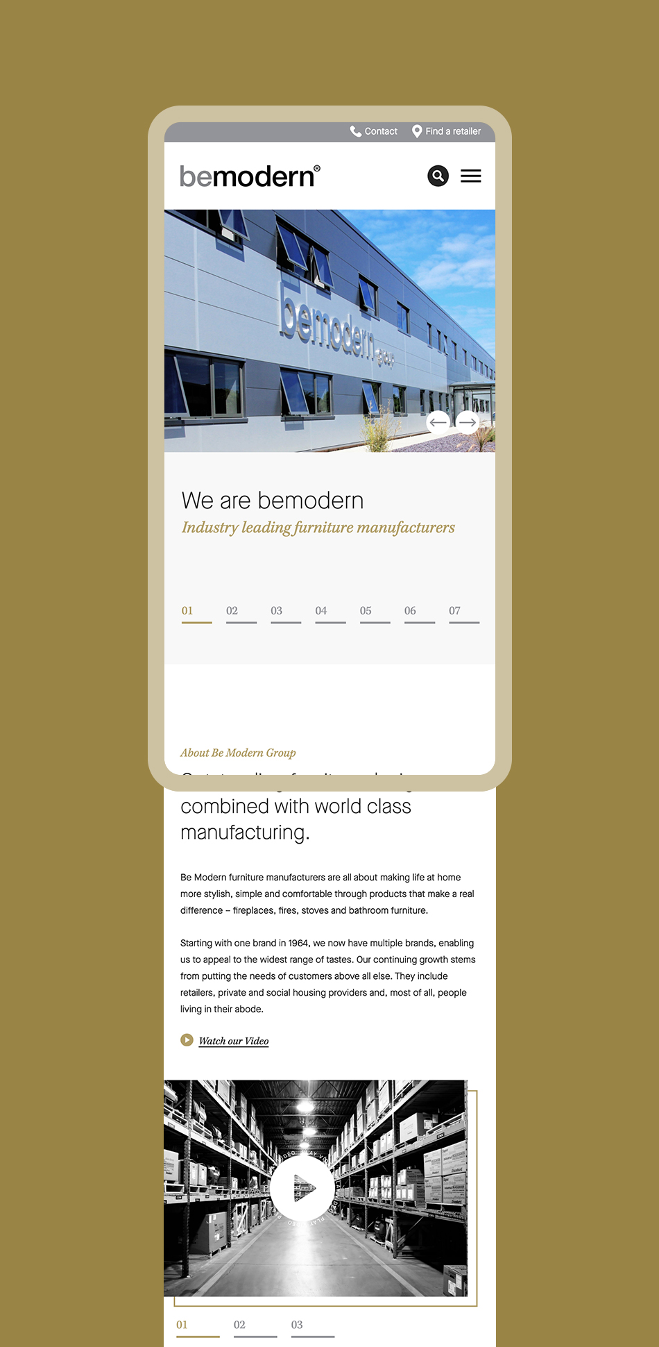
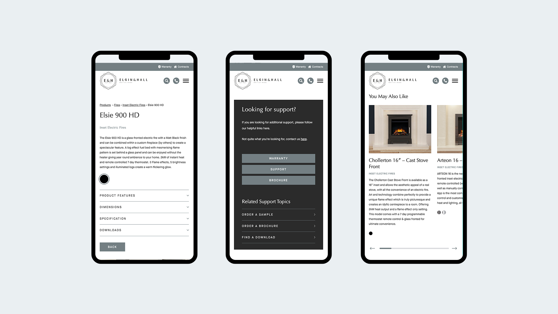
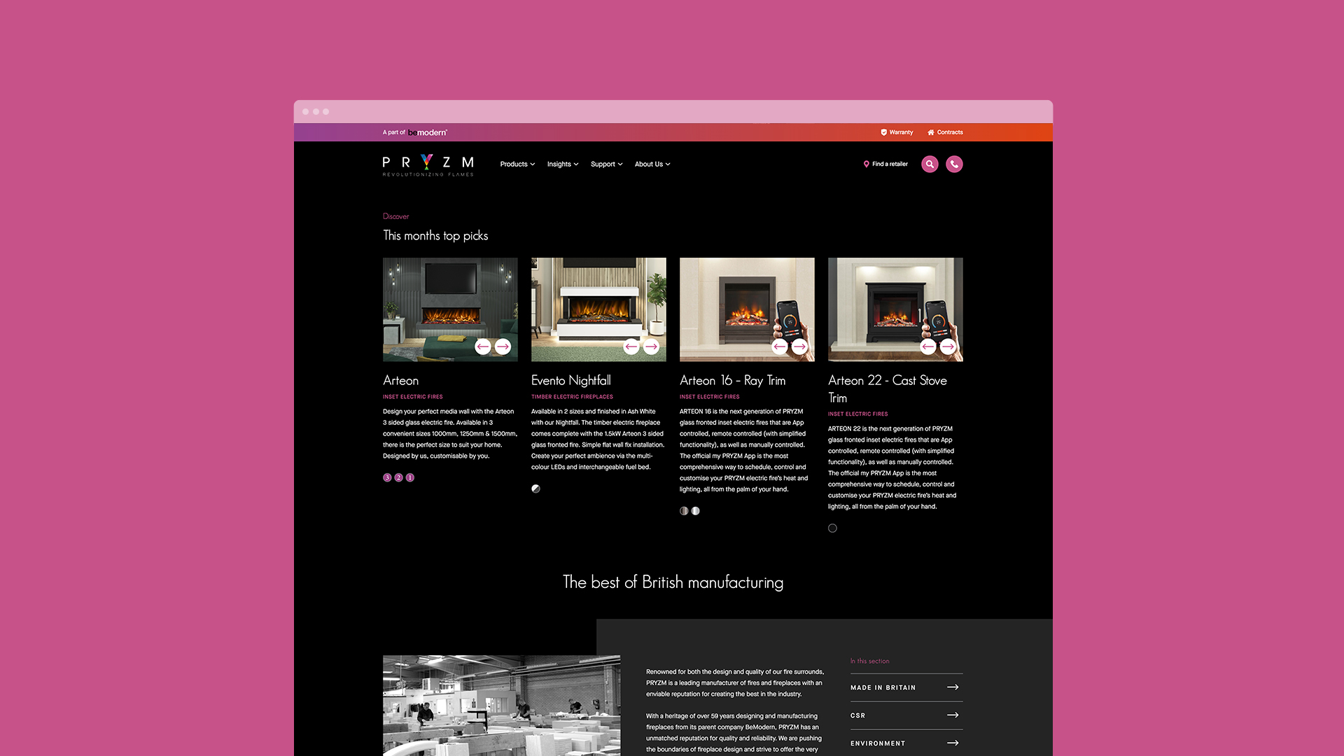
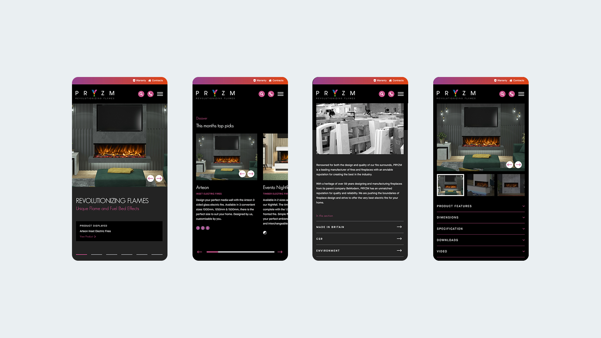
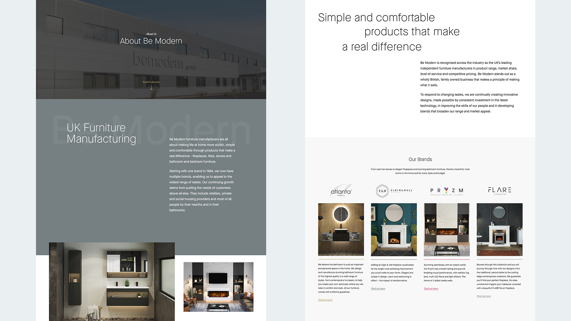
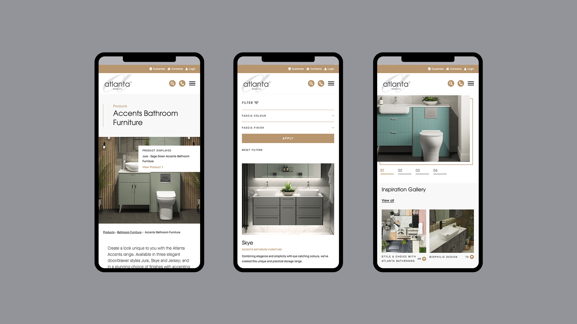
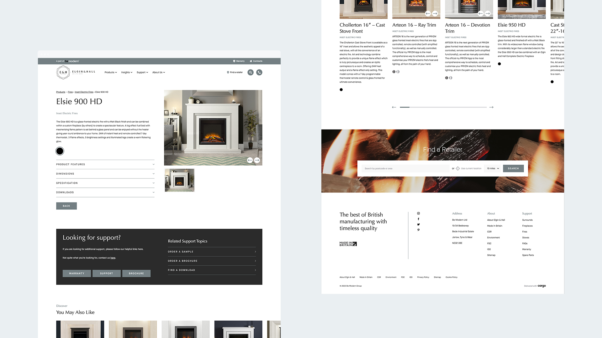
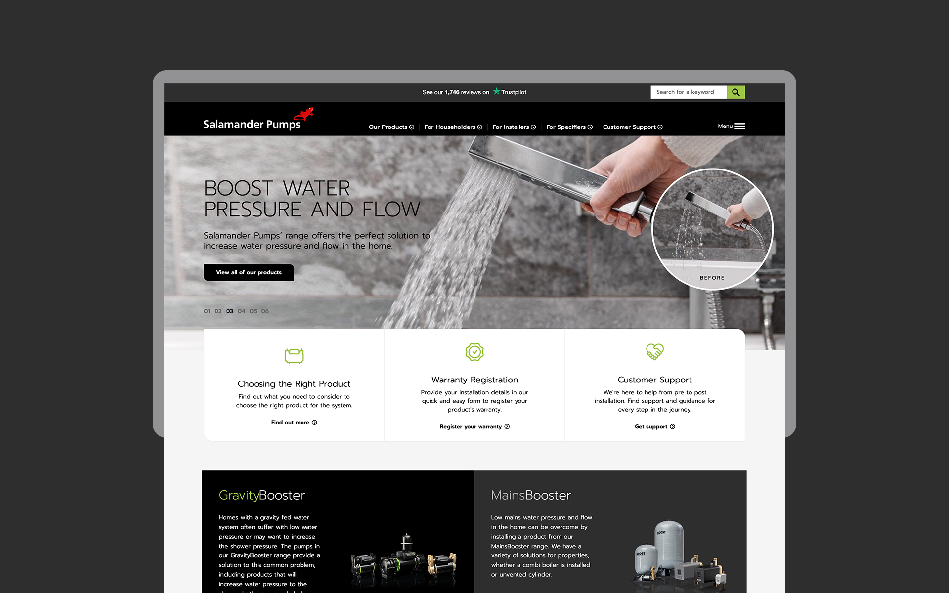
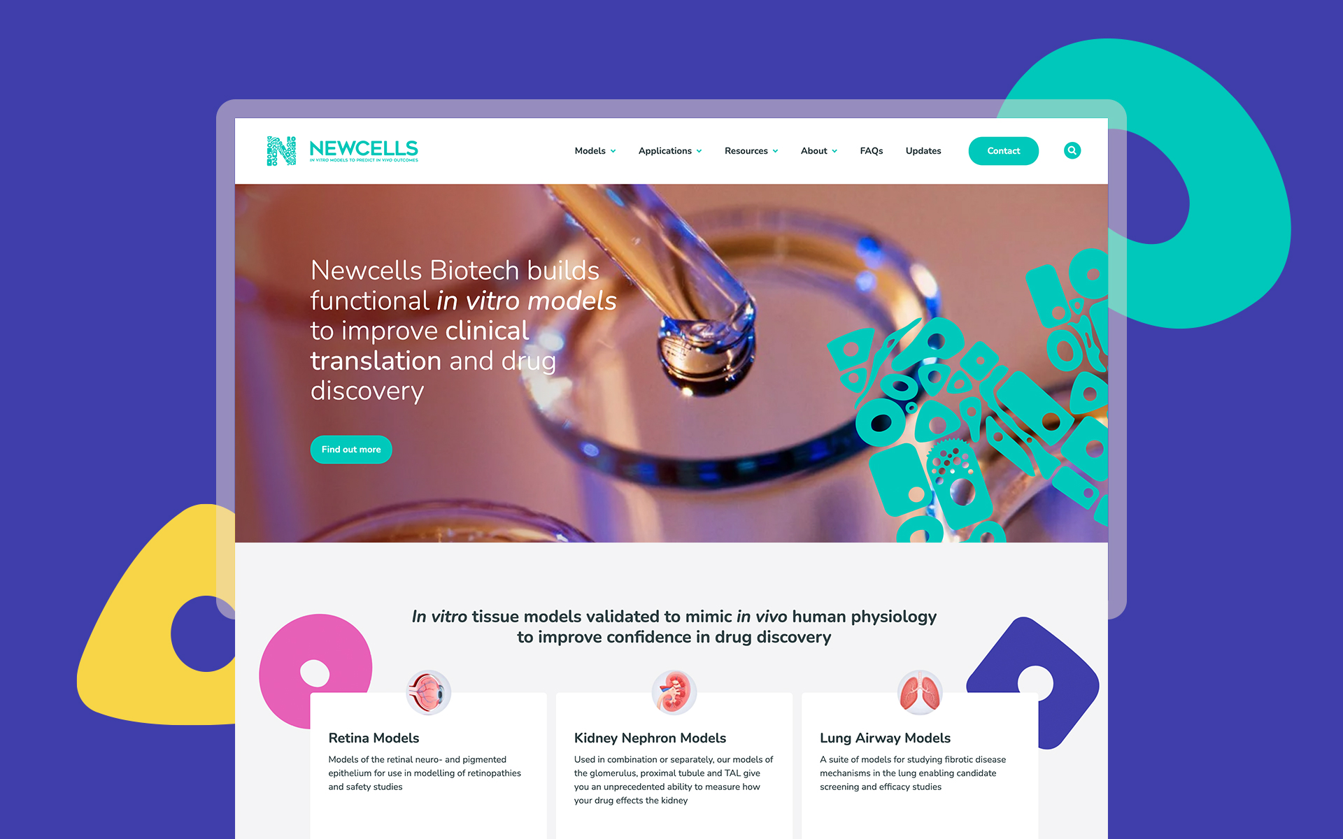
This was a challenge that we have faced several times in the past, and the initial activity carried out was to audit the existing sites. To visualise the task in hand, we initially mapped out all of their content including what needed to move and what would eventually be redirected. The aim was to streamline the user experience and where possible reduce page templates and page numbers to create a better structure.
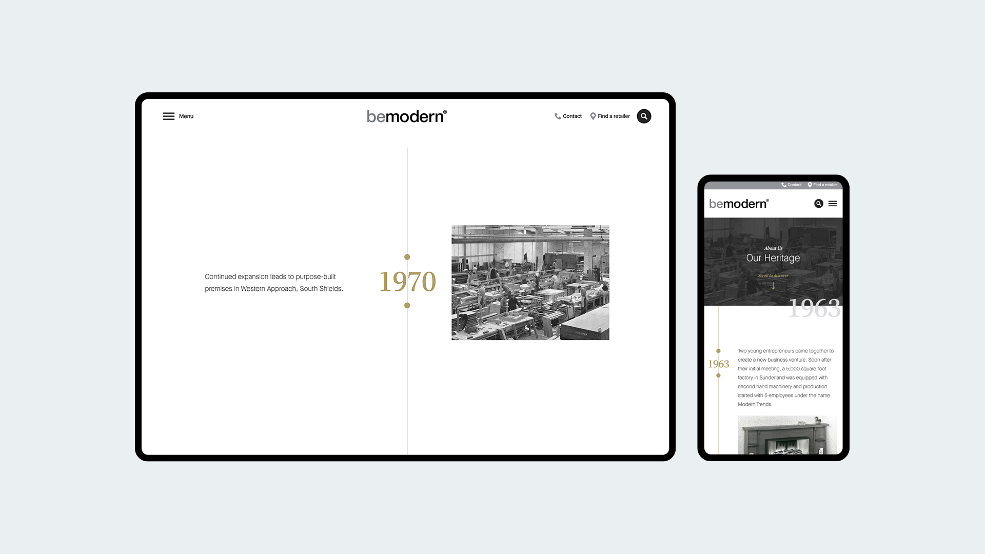
The look and feel of the sites is intentionally minimal, utilising some subtle animated movements throughout to continually provide a luxury feel to the brands. We developed further functionality such as warranty registration and supplier search functionality that become integral stages of the sales process The end result is a large site, that is easy to navigate and really promotes the history and background to one of the North East’s manufacturing success stories, and one which continues to grown and scale with the support of the digital platform that is now in place.
